As a website designer, I love to look at beautifully designed websites to get inspiration for my next project and get familiar with what’s out there. The worst thing is to get behind on the current design trends. Let me ask you this. When you go to a restaurant website that looks really good and in addition to that, has all the information you need to make it there and eat. You feel great right? Well here are 10 restaurant websites that give me that great feeling. They inspire me and I hope they inspire you too.
Let’s dive in.
1. Catch La – catchrestaurants.com/catchla
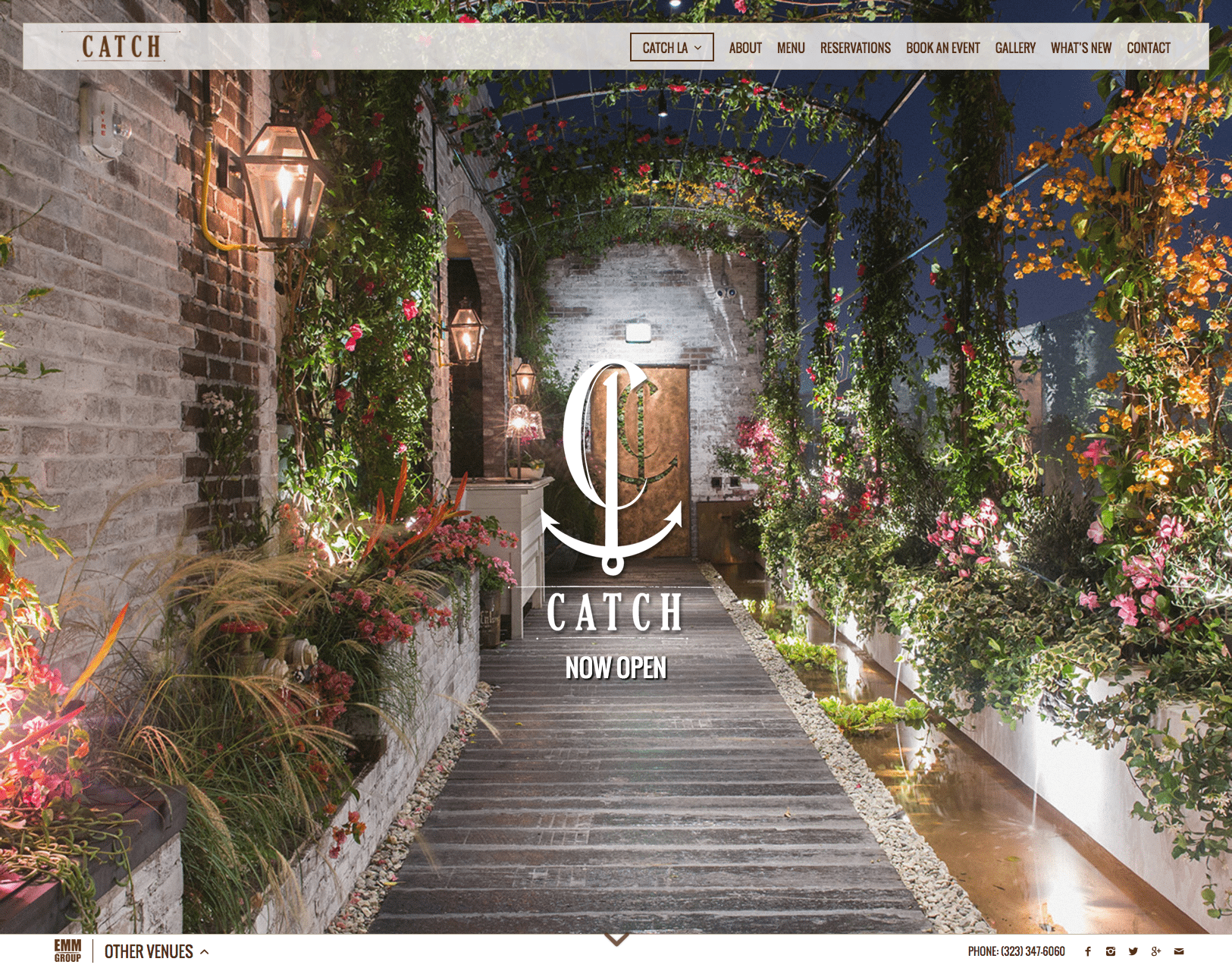
To start off, here is the website for Catch LA. I love this website because it starts off by bringing the customer into their restaurant by using an inviting image of the pathway to their door. The professionally taken photographs show bits and pieces of the restaurant itself, surroundings, food, and beverages. This gives the customer sense of what the restaurant is about. As you may know by now, I have a pet peeve for downloadable menus due to its negative effect on SEO (Search Engine Optimization) but I should say that this section of the website is designed and organized in such a way that it each menu is easily accessed to download. The website also gives customers all the information they need to contact and dine with them.
2. Republique – http://republiquela.com
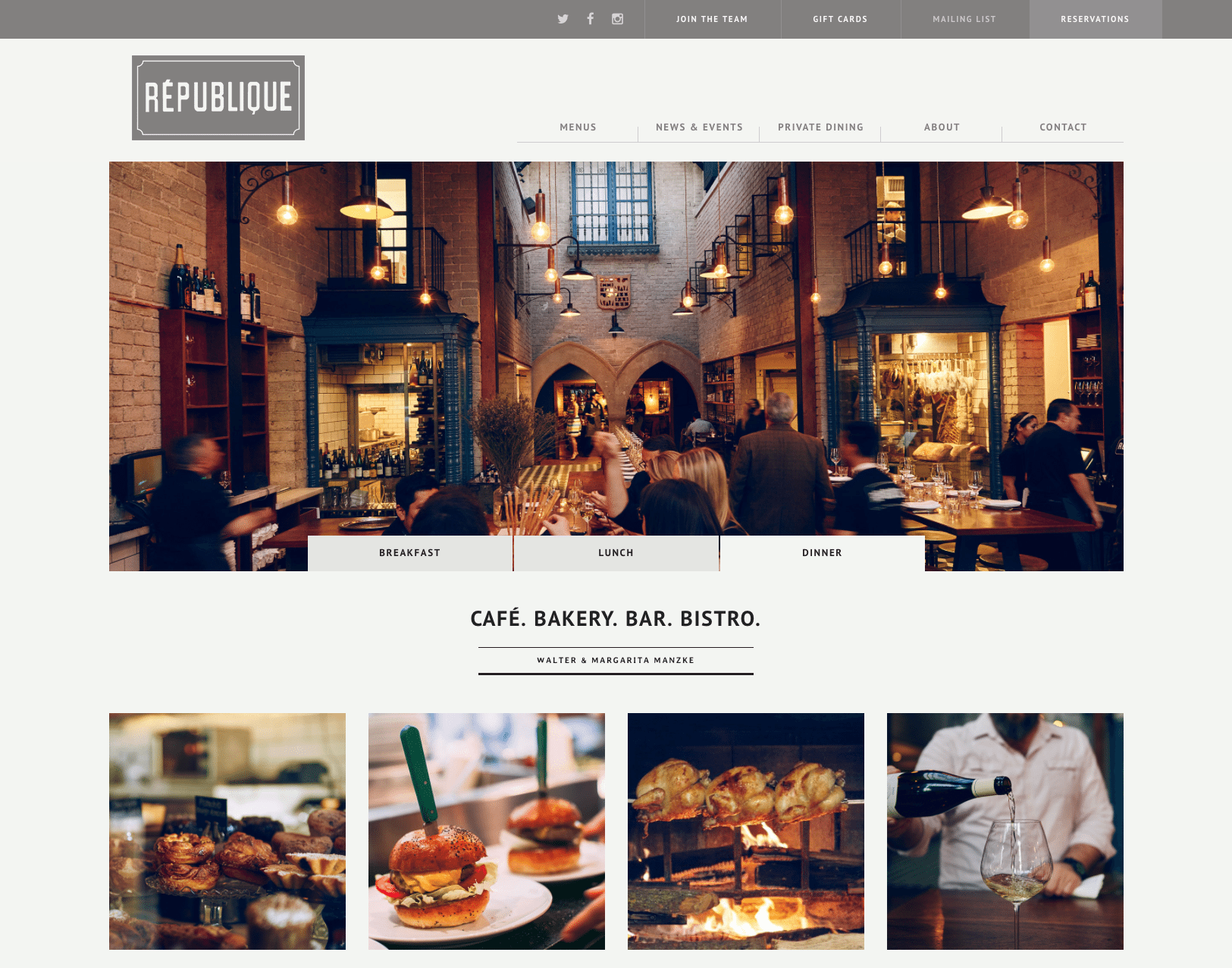
Ooh, this is another restaurant website I love. Its color combination of the brown, beige and blue for the buttons work perfectly well to put your mind and belly at ease when reviewing the website. Here, the photography instantly tells a story about the restaurant’s breakfast, lunch and dinner menus and then continues to bring you in by showing images that represent each menu type. In addition, these images link to their respective menus. Republique promotes their use of social media by adding icons that link to their respective pages and show off their Instagram photos to encourage the community to talk about their food. I also like how they show important links like their join the team, gift cards, mailing list, and reservations right at the top of every page. Overall the look of this website makes you want to visit it to experience the culture and food.
3. Lukshon – http://lukshon.com
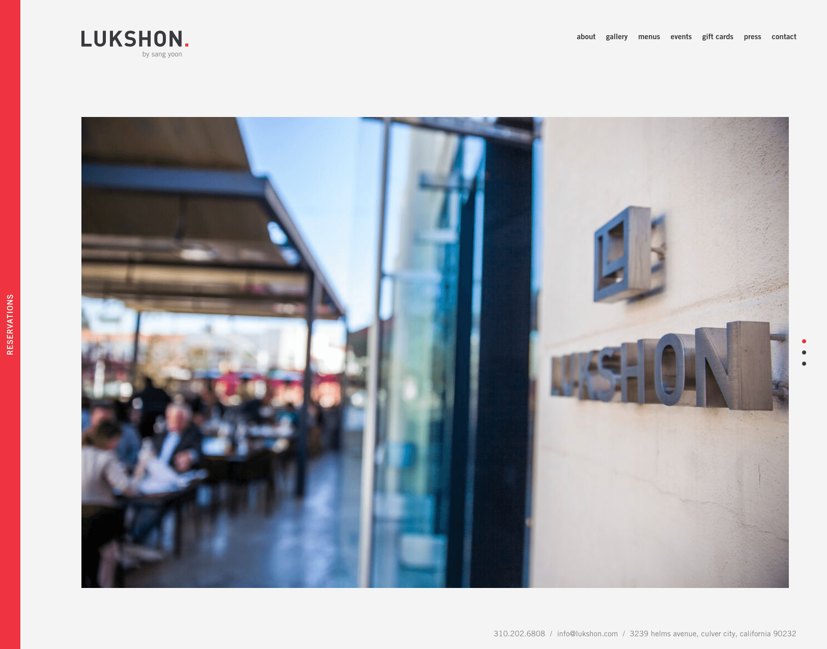
Now this one-page website for Lukshon is just simply modern and beautiful. It is a fullscreen website so it takes up the space of the entire screen when viewing it. What excites me, is their reservations tab. The red color draws your attention as intended and reiterates the fact that they are trying to encourage customers to book a table. The functionality is just plain “cool” as it slides from the left side of the screen and takes the full screen when opened. The image menu here is a deduction because it has a low resolution, is hard to read and bad for SEO (Search Engine Optimization) but their photos are very professional with a style matches the modern website feel. Lukshon also integrates their social media on the website as a good way for the community to get involved.
4. Here’s Looking at You – https://www.hereslookingatyoula.com
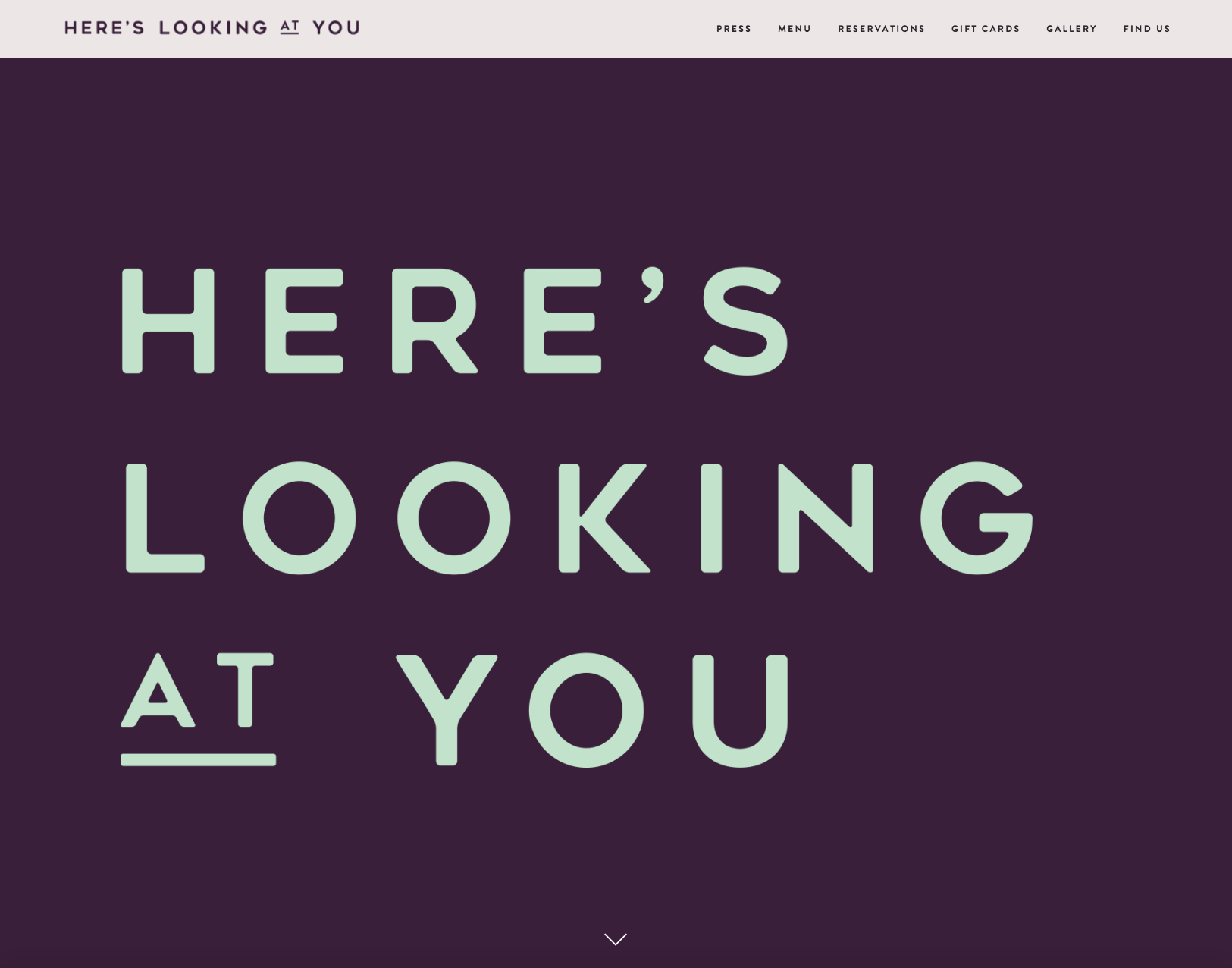
Here’s Looking at You has a website that simply does a great job of capturing their brand. The header image, it grabs attention right away with its bold text and vivid color contrast. You will notice that in the gallery, there is an image of their large shop window that looks just like header image. I thought that was cool. They did great by adding a link to a review article right in the middle of the home page. Adding reviews to a website builds trust, which is great for customers.
5. Bestia – http://bestiala.com
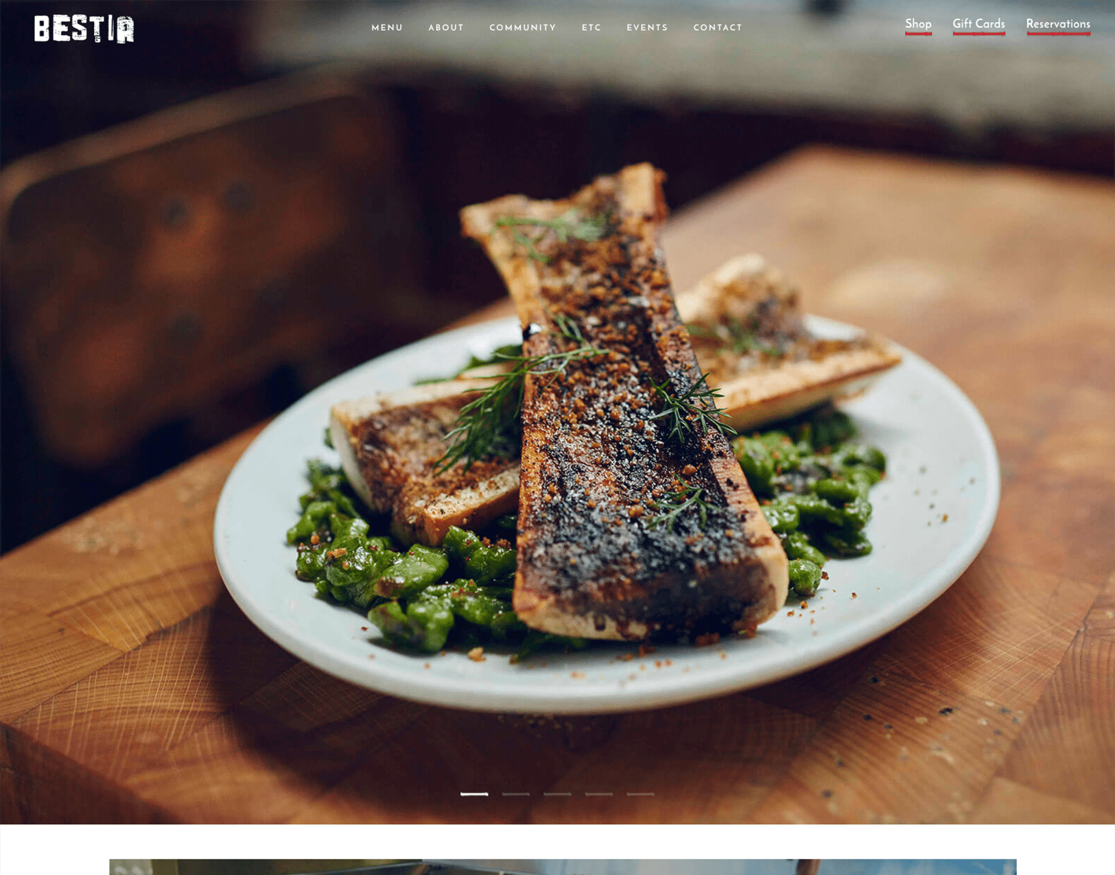
I simply adore this website for Bestia because it really gives you a sense of the culture of the restaurant. It shows the unity between the chefs and employees and gives you a great idea of the food they serve by their image choices, color choices and design style. I also love how their menu is legibly listed and broken up into sections by images describing the section.
6. Alma – http://alma-la.com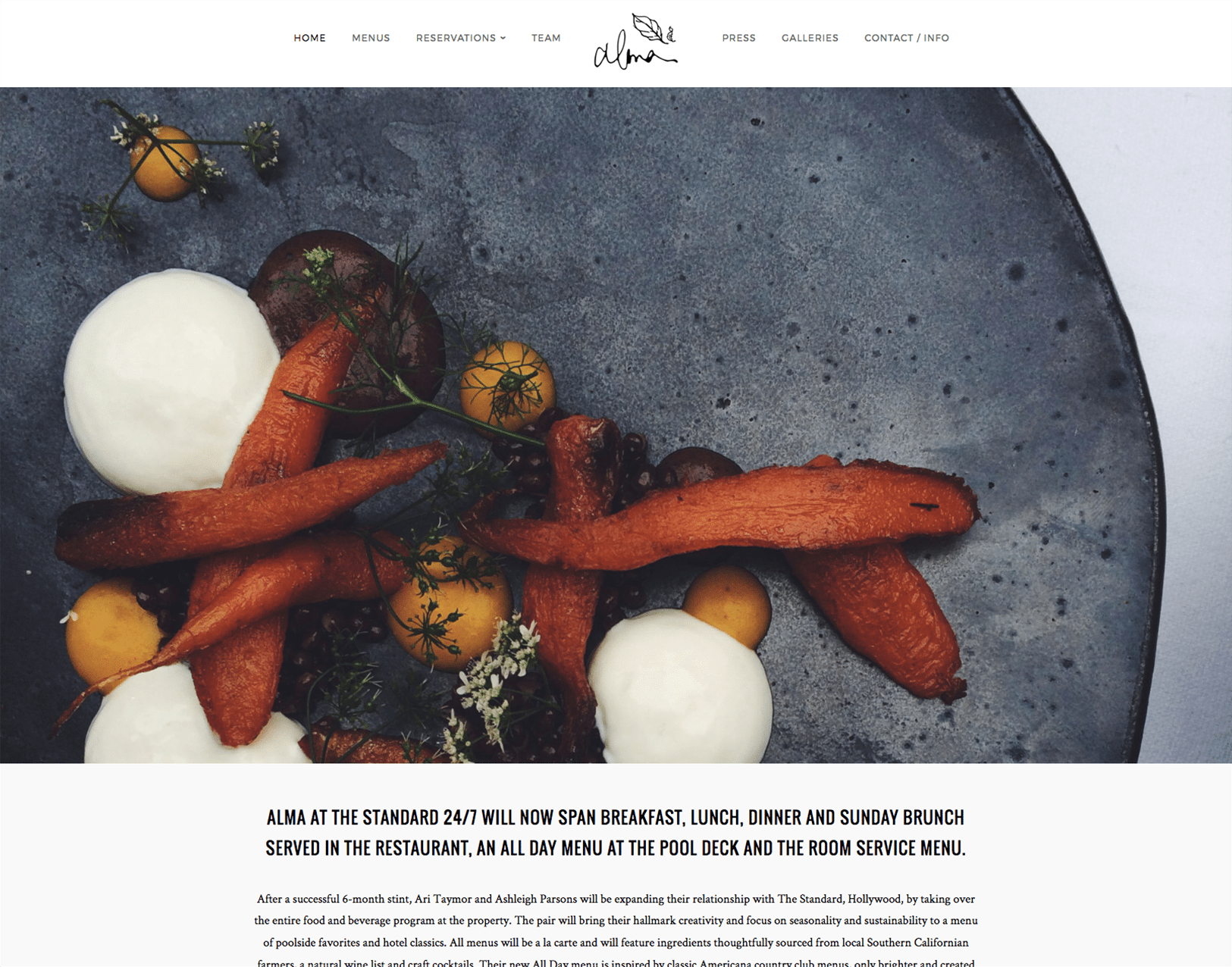
Minimal and modern are the words I would use to describe Alma’s website. The simplicity of the website and the raw and imperfect nature of the photos and food create a very rustic feel. I fell in love with this website because it has a lot of character. I was a is a nice touch including their pup as a member of the team because it shows emotion. Very inviting … I really want to go there.
7. Vallier Bistro – http://vallierbistro.com/en
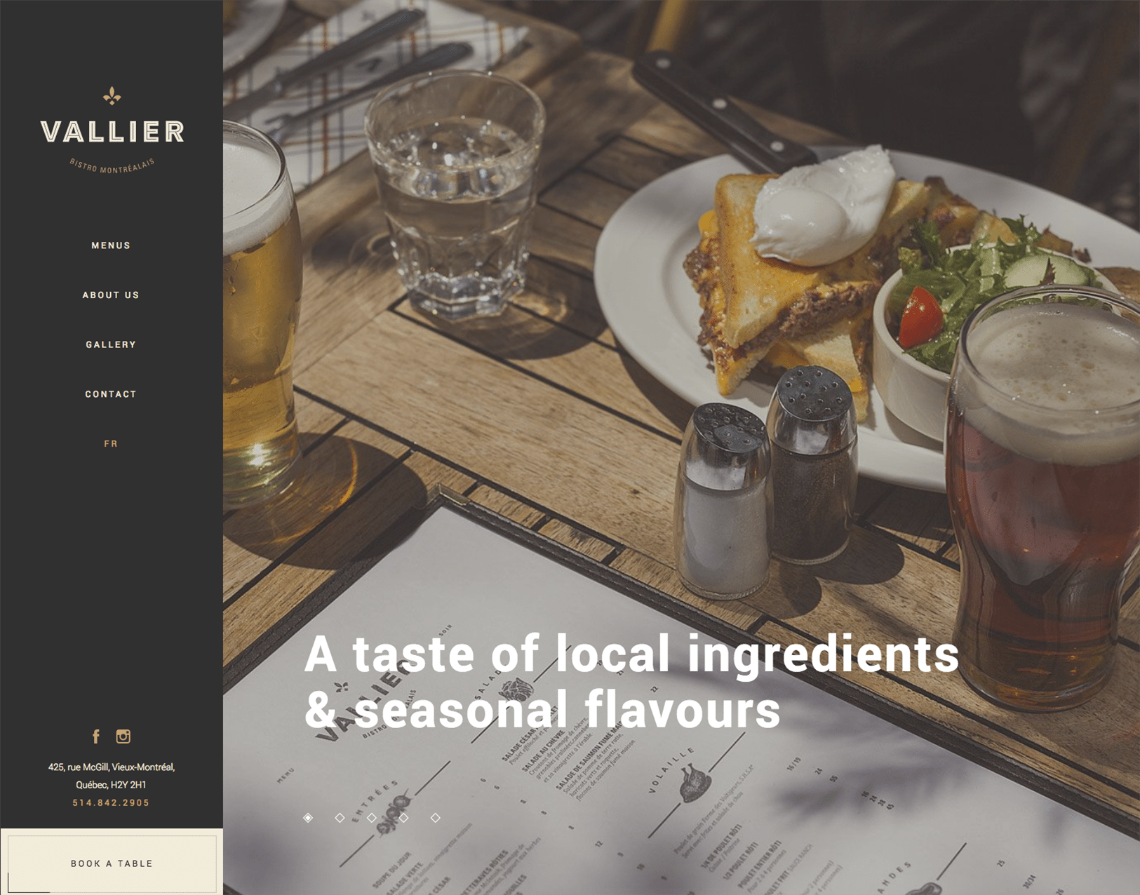
Vallier Bistro is a restaurant located in Canada and it simply exudes high-quality food and a classy atmosphere. Once you get to the website, you are invited with a full-screen zooming slideshow of images of the food and atmosphere of Vallier overlayed by titles giving details about who they are as a restaurant. The one-page website works well with the minimal content because it provides us with straightforward information about them, their food, and how to find them. Seriously, when you think about it, these details are the basics of what customers need to see on a website to make a quick decision on where they want to dine. Overall, straight to the point, beautiful, and classy.
8. Black Bottom Cafe – http://blackbottomcafe.com
Black Bottom Cafe is a restaurant that serves healthy southern food for pick up or delivery. Their colorful images give customers a visual taste of their cooking. I like that they promote southern hospitality with their image choices. The script font in combination with the bold text for their section titles definitely places a lot of emphasis on the sections. Their menu page is laid out very clearly and provides a good amount of detail about their food choices.
9. Mercer Tavern – http://mercertavern.com
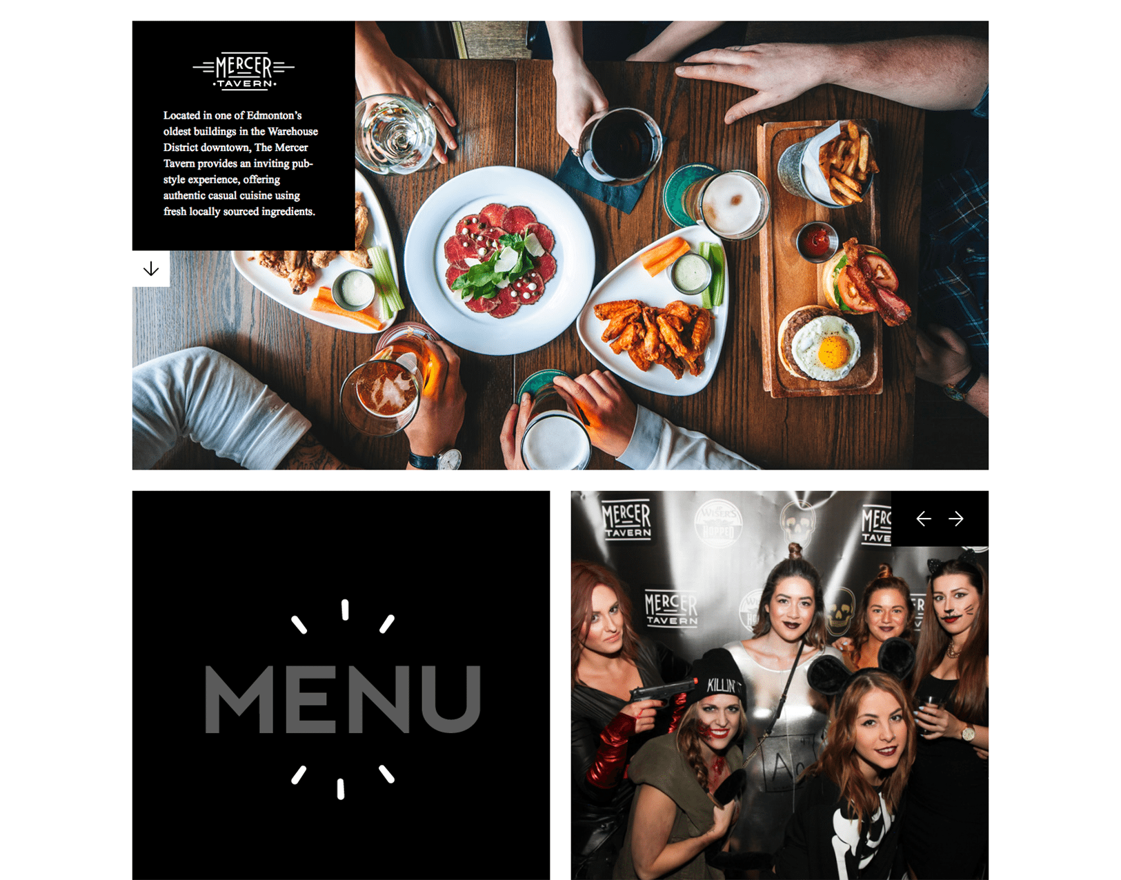
Yeah, yeah, I know I have mentioned in almost each of these reviews how much I love each website but this one here is one that I really, really love. The Mercer Tavern website is just simple. It is a one-page site that uses a grid layout with all the information you need right in front of you. It has a main image, menu, photo gallery, hours, contact information, careers, social and newsletter sign up simply placed on the one-page site. Flashing text is a thing of the past but how they use it on the menu button is attracting and less intimidating.
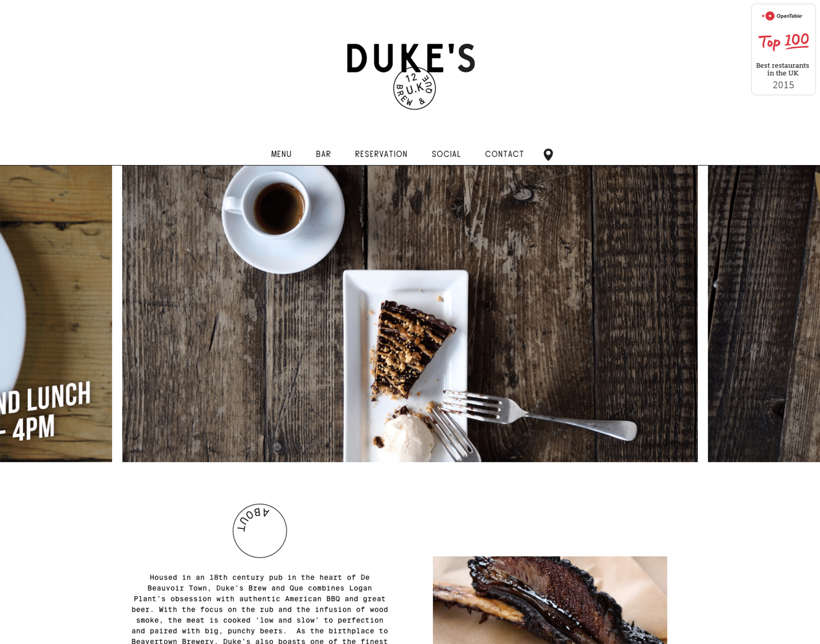
10. Dukes – http://dukesbrewandque.com
Duke’s is another example of a good one-page website. The monospaced font type gives a hipster feel to the design. I especially like how they integrated their social media into the navigation of the website so it is so easy to find them.
Well folks, that’s all I have for today. I hope these 10 successful restaurant websites were as great of an inspiration for you as it was for me. If after looking at these, you feel that it is time to get your website redesigned or newly designed, I highly recommend discussing this with your web designer or contact me here at ASBA for help. Good luck!

