One of the reasons I decided to niche my design studio to the restaurant industry is because I am sick and tired of landing on bad restaurant websites. The internet is full of them! My dream is to make the restaurant website world a better place so it’s much easier for me and the rest of the world to easily select the right restaurant. As a restaurant, there are a few must-haves necessary for your website to be successful. Here are a few essential pointers I have compiled for restaurant owners and designers in the industry.
1. Mobile-Friendly
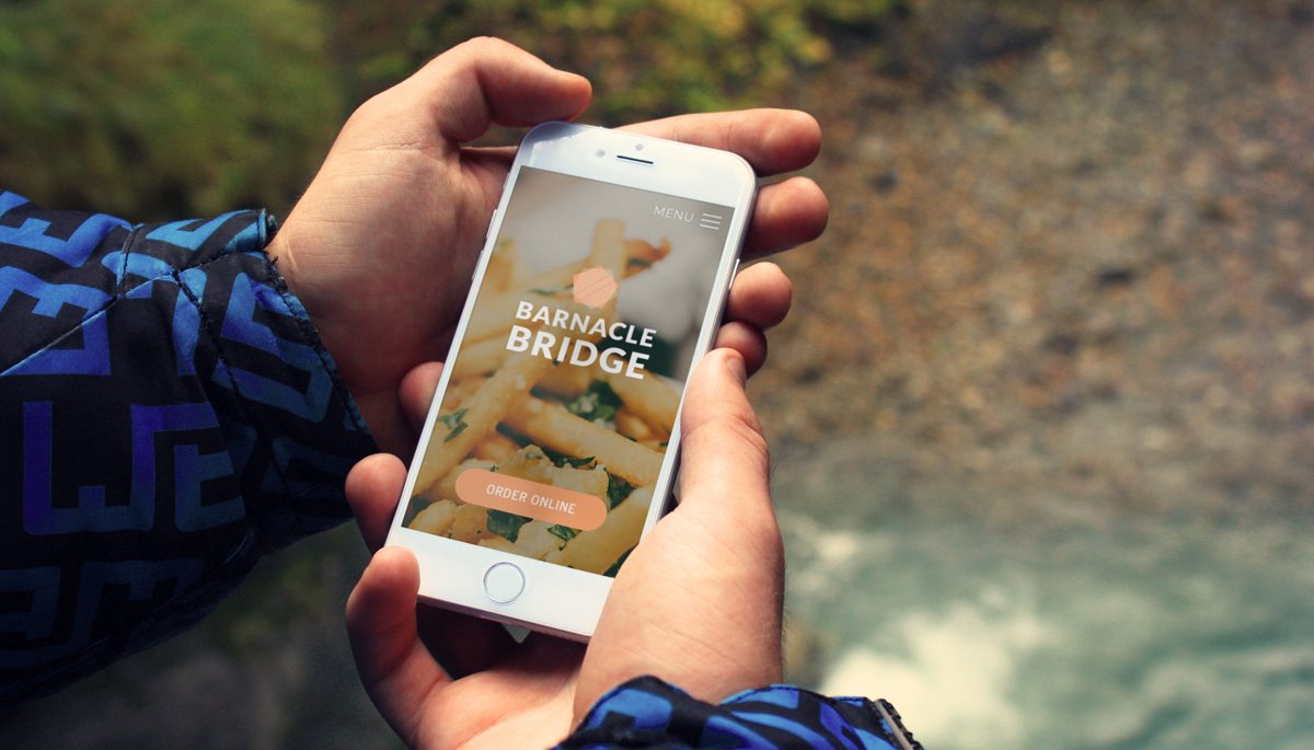
Your website should be mobile friendly especially because statistics show that 83% of people on the hunt for a place to eat use their mobile devices. If your website is not mobile-friendly, what happens? You miss out on a whole lot of potential customers! A responsive website is the solution to this issue. Responsive websites fit any device regardless of the screen size so no matter what device you’re on, it will display legibly. Having a website that is not mobile-friendly, also goes against the current Google standards and tremendously affects search results. Use the Mobile Friendly Test Tool to test if your website meets these standards.
2. Integrated Menu
For a restaurant, your menu is one of the most important parts of your business, therefore you want to make it super easy for your visitors to view it. Some folks might say, “ I will just upload a pdf of my menu, quick and easy”. Yes, it might be quick and easy but why would you want your visitors to have to download it to see the menu. Is that something you really want? Think about how slow that might be for visitors on devices. What if the menu does not download? Sadly, they leave :(. Having an integrated menu means that your menu will be displayed as text, not an image so your users do not have to pinch and zoom to try to make out text. Having an integrated menu makes it easy to see your menu and allows it to be easily found by search engines.
3. Gallery of Amazing Photos of Your Food
People love to see images because it helps them in their decision-making process. Showing just a few photos of your food will push you ahead of the rest and make your visitors crave your food. Photos give customers an idea about the type of restaurant they are ordering from which is something many people love to know. Just a few photos are enough as too many might overwhelm your customer. It is a great idea to invest in a professional photographer to take beautiful and professional pictures of your restaurant and food so here at ASBA, we offer a professional photography service to go along with your web design project. If interested, ask about our photography service in your consultation or if you are feeling adventurous and would like to try to take your photos yourself, see our post about tips on taking great food photos.
4. Social Media Integration
Think of social media (Facebook, Twitter, Yelp, Instagram etc) as your word-of-mouth promotion. People like to recommend where they dined to their friends and family. It’s just human nature. Get on this train to get the benefits. Just add your social media icons to your website but make sure you are active on these platforms and that they have content relevant to your restaurant. If you have a Yelp profile, look into adding a few testimonials from some of your happy customers to the website. Happy customers = more customers.
5. Online Tools for Reservation and Online Ordering
If you take reservations and phone orders, I highly recommend you have a tool for that on your website. Integrating tools like Yelp, ChowNow, Open Table, Door Dash, Eat24 and others will definitely take you a step further in standing out from the crowd and making it convenient/available for your visitors to eat from your restaurant.
That, my friends, concludes my tips for a successful restaurant website design. Are there any other tips you would like to share?


