by restaurantspider | Sep 7, 2017 | Restaurant Tips
If you are a restaurant or restaurant goer, you will notice that some restaurant websites have the ability to make reservations. Giving guest the option to make reservations is a great marketing strategy for restaurants and helps you plan for visits and reduce your real time revenue reliance on walk ins.
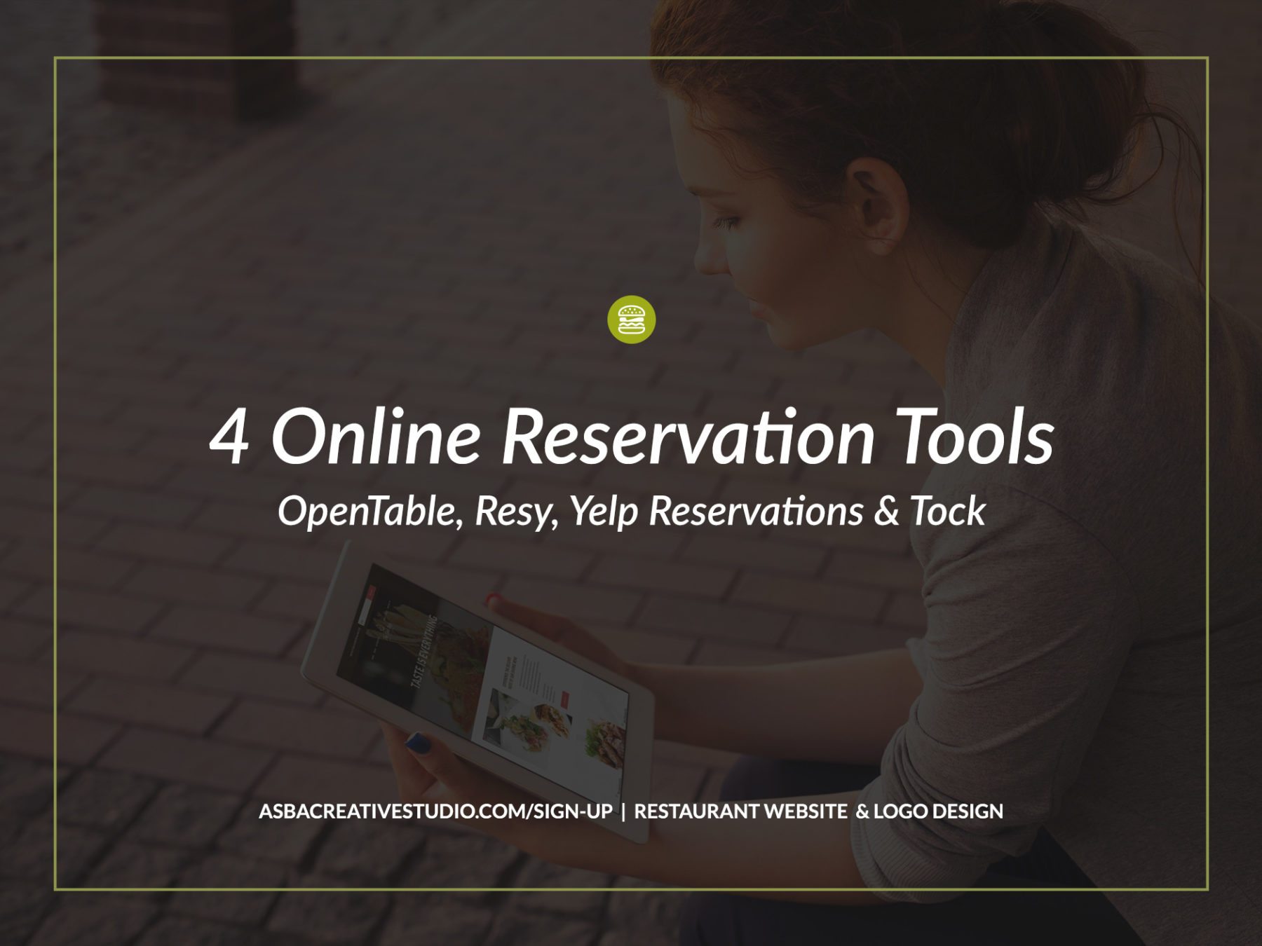
There are a few ways to achieve this. We have the more traditional way where customers call the restaurant to make a reservation. Secondly, a restaurant can have just a general form on their website where customers can type in their information, send it out to the restaurant in hopes of making a reservation on the day of their choice. Lastly, there is the option, which is, subscribing with a company that is in the reservation business to make reservations and seat management as seamless as possible. Well, here is a description of 4 reservations platforms you might consider.
OpenTable is the leading platform for online reservations. When you think of reservations, the first place that comes to mind is usually OpenTable. They have been in this space since 1998 so it’s been a while. In addition to their services, they offer a reward system to customers who reserve through their platform by giving them $10 in points towards their next meal and customers love it. If you are a restaurant that has reservations as a major part of the business OpenTable would be a great restaurant marketing fit for you as they offer a wide range of services. Some of their features include reservation management, waitlist management, credit card vaulting, passcode protection, wireless chit printing, integrations & APIs, recommended tables assignments, table blocking, holiday promotions, reservation timeline view, alerts & notifications, multiple floor plans and more.
OpenTable’s, pricing starts from $249/month with a setup fee of $1295.
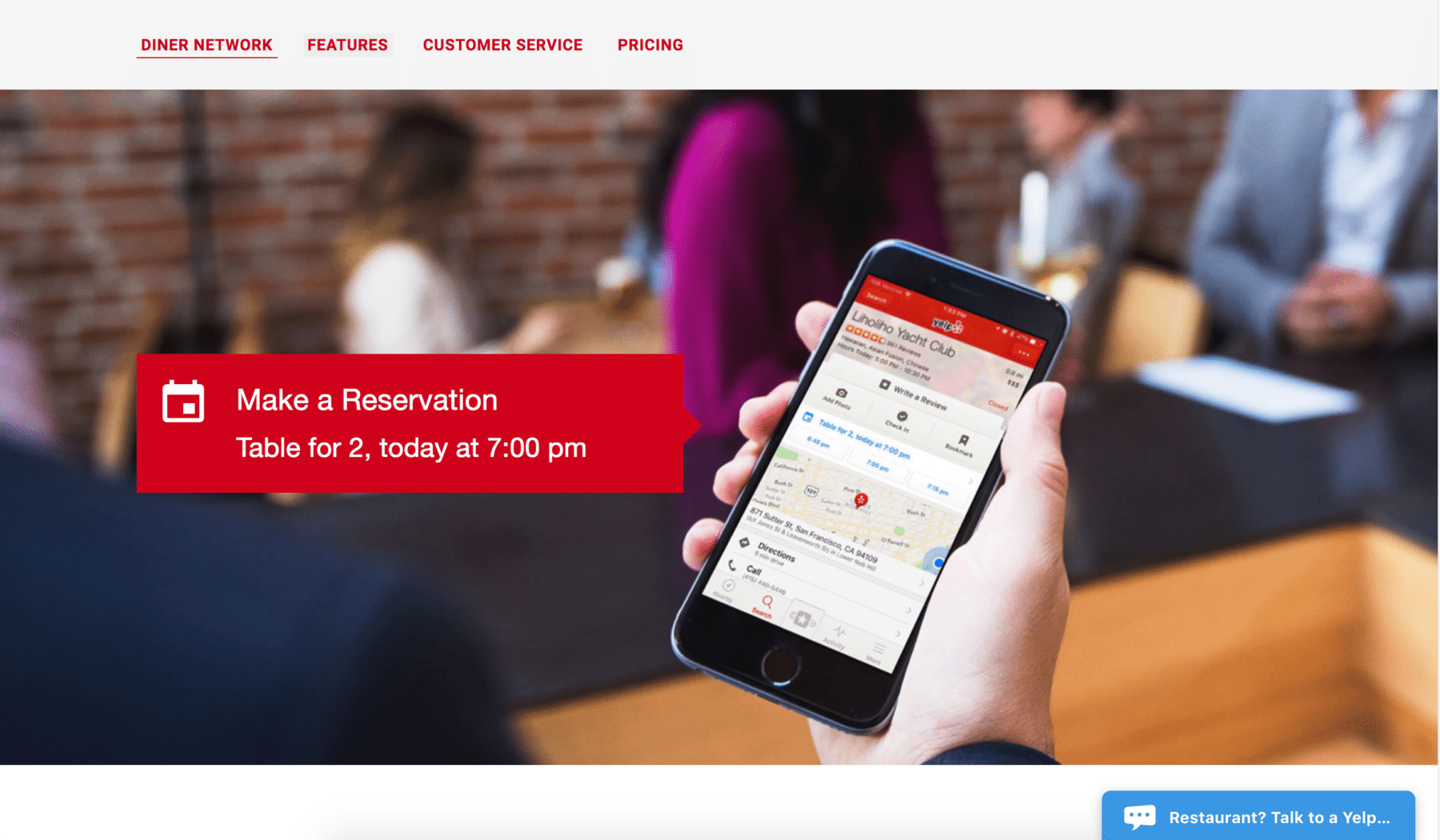
As you all know, Yelp is a great reviewing platform for many businesses especially restaurants. Yelp now offers Yelp Reservations which has a great list of services including accepting reservations from right from your Yelp profile and website, text reminders to guests, table assignment, waitlist management and server management.Yelp Reservations provides these services at a monthly rate of $249 with no setup fee. Also included in the subscription is an iPad to get a full experience with their tools.
Yelp Reservations provides these services at a monthly rate of $249 with no setup fee. Also included in the subscription is an iPad to get a full experience with their tools.
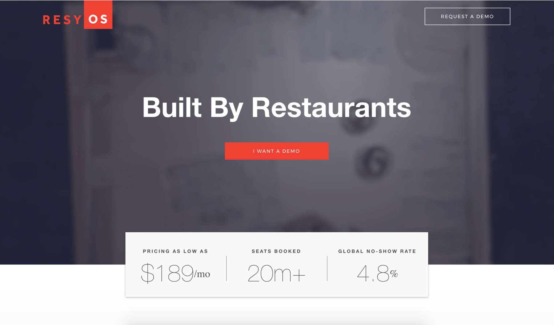
Resy is a complete reservation and waitlist system that includes table management, waitlisting, ticketing, and booking. It is very easy to integrate with a POS system and with your website. It is definitely not as popular as the first two and but you get just what you need at a lower price than the others. Resy also provides “ResyPay” which allows guests to pay and split checks. ResyPay is unfortunately not available with the basic plan.
Resy provides these services at a starting monthly rate of $189 with no cover fee.
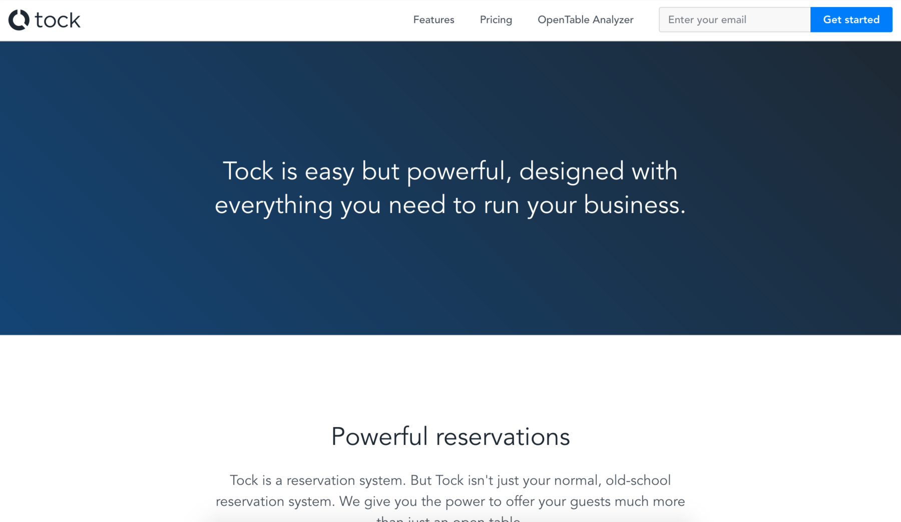
This is one reservation tool I had not heard of before but I love how simple the look and feel of it is. Tock is also a complete reservation system that offers free bookings to guests, prepaid options for bookings, reservation management, table management, guest profiles and notes, texting, financial reporting, booking widget for your website and note taking so you remember details about your guests.
Tock provides these services at a starting monthly fee of $99 with a $0.99 cover fee. No setup fee.
Getting started with a reservation system
In summary, here is a comparison chart of the 4 reservations systems for their starting packages
| |
OpenTable |
Yelp Reservations |
Resy |
Tock |
| Monthly Payment |
$249 |
$249 |
$189 |
$99 |
| Setup Fee |
$1295 |
No extra fee |
No extra fee |
No extra fee |
| Cover |
$1.00 |
No extra fee |
No extra fee |
$0.99 |
| Hardware |
no |
iPad Included |
no |
no |
| Website Integration |
yes |
yes |
yes |
yes |
| Texting |
yes |
yes |
yes |
yes |
| Table management |
yes |
yes |
yes |
yes |
| Take Notes |
yes |
yes |
yes |
yes |
| POS Integration |
yes |
no |
no (upgrade req’d) |
no |
Well, I hope this blog post helps to introduce you to reservation systems out there. Whether you decide to pick one of these 4 as your system of choice or any other system that integrates with websites, note that they easily work with any ASBA Website.
Comment below with any other reservation system out there you recommend.
by restaurantspider | Sep 1, 2017 | Restaurant Tips
Have a restaurant? I would love to hear more about you. How you run it, what you love about it, your pains and frustrations, your customers’ needs and wants, anything you got. One of the essential things that get overlooked easily when running a business is taking the time to learn about your customers. One of the excuses for me is the feeling of taking my clients away from their daily activities because as you know, the restaurant business is super hectic and tremendously busy. My mom had a restaurant for a while and recently started up a catering service so I really understand. I often forget that surveying my audience and asking them questions from time to time a is a win-win for us both. I say this because it helps me know more about you, which in turn helps me provide you with more helpful content and a more useful website and visual branding.
So, with that said, it would love to hear from you! Comment below folks or just send me a message.
Happy Friday!
by restaurantspider | Aug 30, 2017 | Website Tips
Do you feel like you’re stuck in the stone age when a conversation arises regarding websites? Do you feel like your designer is speaking Greek when you talk to them?
Well, I’ve got you covered. I have created a list of some basic website terminology that could possibly save you when you’re in one those conversations. The internet is has become a thing of the norm so it is very helpful if you know at least a few things about websites to get up with the times.
HTML (Hypertext Markup Language)
HTML is basically the language used to create a website. Think of HTML as the frame of your house.
CSS (Cascading Style Sheets)
CSS is a type of language used to create the look and feel of a website. Think of CSS as the elements used to beautify your house like the paint, the windows, the decor etc.
WordPress
Wordpress is an easy-to use content management system (CMS) used for building websites and blogs. A content management system is basically a software used to create and manage website content. The CMS itself is free to use but you would need hosting to use WordPress on the web. Please note that there are two types of ways to use WordPress to create a website – wordpress.com and wordpress.org. WordPress.com websites are hosted by WordPress and wordpress.org is self-hosted. If you want an easily customizable website that you can control, a wordpress.org self-hosted website is what you need.
Responsive Website
A responsive website is a single website that adjusts seamlessly to any device screen size. With a responsive website, there is no need for pinching and zooming to make out the content of the website because the website is developed to look great on all screen sizes.
Website Header
A website header is the top part of your website that usually contains your logo, tagline, social media and other information regarding your brand. It usually sits on top of your navigation and at times acts as a container for your navigation. It is also usually the same on every page.
Navigation Bar
A navigation is the part of a website that helps you go to the different sections of your website. It is the most important part of your website and should be very simple and easy to use.
Call to Action
A call to action is a clickable element (image, button or text) that is used to drive traffic to a specific web page.
Hero Image
A hero image is a large prominent banner located under the header on the homepage of your website. It is usually the first graphic on the page and is used to capture your audience.
Slider
A slider is basically rotating images on a website that is usually placed at the top of a website in place of the hero image.
Full-Width Website
A full-width website is a website that spans across the width of the page.
Full-Screen Website
A full-screen website takes the entire device screen on every device. A part of a website like a hero image can take the full screen and it usually has an arrow or link that takes you to a different page of the website.
Boxed website
A boxed website has a set width and therefore does not fit the entire screen. It has space to the left and right of the website and is usually a solid color.
Website Content
Website content is all the information you need to provide a designer to design your website. The information includes graphics, images, and text.
Landing Page
A landing page is a single web page with a goal of persuading users to take action. It is usually used to target audiences for one specific product.
Page vs Post
A page is basically a static stand alone web document on your website that provides information. Posts are basically web pages that make up a blog. Posts are usually updates and news on a website. Posts help greatly to drive traffic to your pages because blogging creates custom content for your website which is great for search engines.
WordPress Plugins
Wordpress Plugins are used to add new functionality and features to a WordPress website. WordPress itself is very basic and in order to be more customizable, it needs the help of plugins.
Keywords
Keywords are words or phrases that are added to your website to help drive traffic from targeted audiences. In the keyword world, phrases work better than single words because they reduce irrelevant matches.
SEO (Search Engine Optimization)
SEO is a method used to drive traffic to your website by making the content of the website searchable with the use of keywords, image titles, and links.
SEM (Search Engine Marketing)
SEM is a combined method to drive traffic to your website from various sources like Google AdWords, Bing ads, Facebook ads, banner ads etc.
Registrar
A registrar is a company you use to register your domain name.
Domain Name
Your domain name is the name users will type into the browser to access your website. They can end with .com, .net, .org, .co etc. For example “asbacreativestudio.com” is a domain name.
Hosting
Hosting is storing your web files in a location where it can be accessed on the internet. In order to have a website, you must have hosting which usually requires a monthly payment to your hosting company.
MockUp
A mockup is the undeveloped design of a website that is shown to a client to preview the design of the website before it is developed.
Opt-In
An opt-in is a form or button on a website used to collect email addresses in exchange for something of value.
Well, there you have it. I hope this post helps you carry on conversations with your designer or people in general who are web savvy. If you have any other website terminology you need to decipher, comment below and I’ll help answer your questions!
by restaurantspider | Aug 23, 2017 | Restaurant Tips
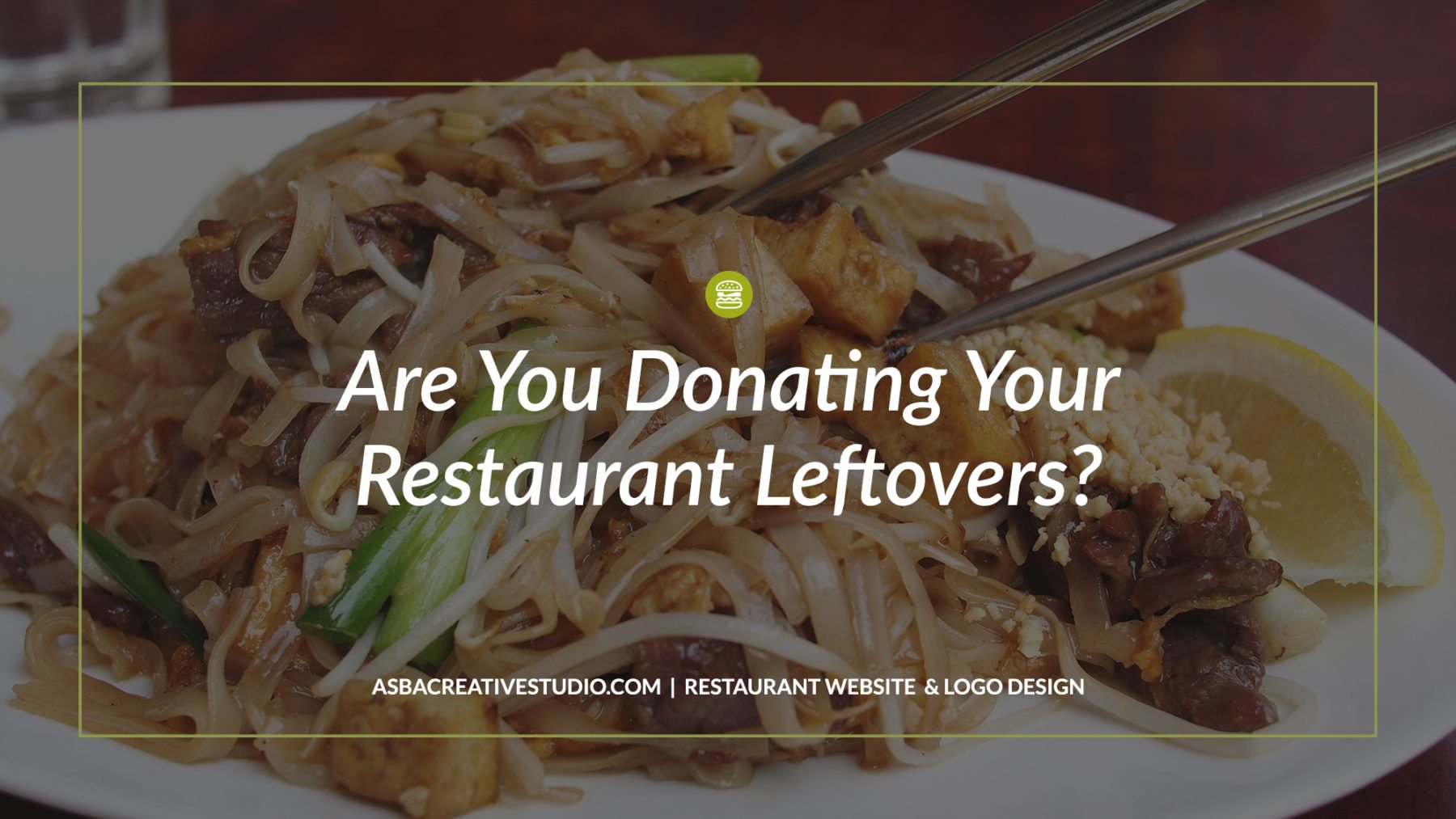
Every time I eat at a restaurant, I can’t help but think of all the food that could possibly go to waste in a day. This got me wondering—do restaurants actually donate food, want to donate food or even know how to donate food? Does all this good food end up in a landfill? With a little bit of research, I found out that it is possible but sadly, there aren’t many restaurants participating in these programs.
In an article by David Lazarus in the LA Times, regarding an Orange County program that makes donating leftover food easier, there was a quote by a restaurant owner that really caught my attention.
“Most of us live by the credo ‘When in doubt, throw it out,'” said Mike Learakos, owner of Katella Grill in Orange. “There’s a big fear of liability if you donate leftover food.“
It became known to me in the article above and another article, Restaurants Officially Have No Excuse Not To Donate Leftover Food by Eleanor Goldberg of the Huffpost that there really is a huge fear among many restaurant owners of getting sued by the recipient if they get sick. Well, it’s great to know that this stigma is not true.
Restaurants Are Protected When Donating Restaurant Leftovers
Within both of these articles, I learned that there is a federal law that protects food donors from being sued in case of any issues regarding recipients getting sick or hurt from ingested food. It’s called the Bill Emerson Good Samaritan Food Donation Act and it was passed by President Clinton on October 1, 1996. The law protects good faith food donors from civil and criminal liability that later causes harm to the recipient. The law protects food donors, including individuals and non-profit feeding programs.

According to HuffPost, a single restaurant in the U.S. wastes about a whopping 100,000 pounds of food a year. Yup. I bet you would agree that it’s a pretty big number. Well, in hopes of encouraging restaurant owners to donate any excess food, I have made it easy and created a list of organizations that provide details on how to become a donor.
https://www.rescuingleftovercuisine.org/
https://www.wastenotoc.org
https://412foodrescue.org
http://www.campuskitchens.org/
http://www.foodfinders.org/
https://www.lafoodbank.org/
https://www.wedontwaste.org/
http://www.chefsendhunger.org/
https://www.re-plate.org
There are so many people in our communities, adults and children alike, that are starving because for one way or another cannot afford to buy food. Donating your restaurant leftovers is definitely a way to give back. Start donating today!
Have you donated any leftover food yet? Comment below on your experience with the donation process.

by restaurantspider | Aug 17, 2017 | Website Tips
When you have a website, one of your goals is for it to be an extension of you as a restaurant and a restaurant owner. It needs to serve as a platform for you to give customers a feel of your food and your establishment, a place for interaction between the customer and your restaurant and a place to help customers to find you. Customers want to feel welcome so it is great to provide tools on your website that create this atmosphere. Having a website is one of the top restaurant marketing ideas, and a key tool in your restaurant marketing plan.
By the end of this post, you will learn 3 simple ways to improve your website and restaurant marketing with your website to enhance a welcoming atmosphere to in turn increase traffic to your restaurant.
1. Clear & Easy to Find Contact Information
I have had a few run-ins with restaurant websites where I simply cannot find basic contact information. When this happens, I either check another source, if I really need to go to this restaurant or I leave the website and find another place. The second scenario is the most popular and that’s not a good thing. Make sure phone number or contact page link is placed in areas of your website that customers cannot miss. Your contact page link should be placed preferably in the navigation which is the first place a customer looks when they need to navigate your website. I will strongly advise that your phone number and address should be in plain text so it is clickable on a mobile device. Nowadays, there seems to be an underlying motto of “if it’s not easy, I don’t want it” so don’t get caught in this web. In this same thought, make sure your map is an embedded Google map, not an image so customers can easily map out their journey right from your website. Adding your social media profile page links is also a great way to add to the ways a customer can contact you.
Example 1
The Bancroft clearly displays contact information prominently in navigation and on the home page of their website.

Example 2
At the bottom of every page, The Eddy displays a map and all contact information

In summary, customers need to know where you’re located and how to contact you. Don’t hide it.
2. Customer Reviews / Testimonials
Reviews and testimonials are a great way to engage customers but it, for some reason, tends to be one of the overlooked restaurant marketing ideas when creating a website. When I’m about to place an order of pad thai (my favorite Thai dish) from a Thai food restaurant I’ve never been to, I love to read reviews on customers’ experiences with the pad thai and how quickly it’s delivered. Once those two areas check off with great results, I’m sold but if I am unable to find this info, I rarely order from there. As humans, we love to get recommendations on things other people have used and are happy with because it reassures us that we are making the right decision. Listing reviews from customers on your website is a great way to push people to want to eat at your restaurant. Yelp, Google, Trip Advisor, Zomato and others are great platforms to get your customers talking about you. Get a business profile set up through these review platforms and keep it up to date. Grab your best reviews from there and place them on one of the pages of your website to entice your customers. As simple as that. Doing this is not only a great way to bring people in but it also serves as a way of knowing where you are doing well and where you are not. There should always be room for improvement.
Example 1
Quay does a great job by showing a slide show of customer reviews on their about page.

Example 2
Heres Looking at you shows a link to a review by LA Times right on the home page of their website. Since this review is of great standing, just the one review says it all.

In summary, flaunt the great things people have to say about your restaurant. It sells!
3. Opt-In Forms
I rarely see opt-in forms on independent restaurant websites but it is a great tool in the restaurant marketing plan and is very easy to start. An opt-in form is a simple form with an email and/or name field to capture email addresses and in return provide them with something of value. Your email list provides you with a large list of people interested in the food and culture of your restaurant. You can send menu updates, events, promotions like a “Free burger on your birthday”, “Taco Tuesday”, “Milkshake Thursday”, whatever, to give subscribers an urge to come in. You have to note that when one person comes to your restaurant, they rarely come alone… Chi-Ching. Your opt-in form can be placed at the top of your website, on your contact page, in the footer of your website, in a pop-up box, in a blog post, at the end of a blog post or even on every page. Some of the best choices for setting this up would be email marketing platforms like Mailchimp, Mailerlite, Mad Mimi, InfusionSoft, just to mention a few. These platforms include many other email marketing features that can add more value to your online presence. To save you money starting to grow your email list with email marketing, Mailchimp offers a free service with up to 2000 subscribers and Mailerlite (who I am affiliated with and use on my own website) also free with up to 1000 subscribers.
Example 1
Here is an example of a pop-in opt-in form on Lemonade’s website. On this website, it pops up right when you enter the website but it is possible to adjust the timing, in your email marketing platform, of when the form pops up after a customer goes to the website.

Example 2
Here is an example of Red Bird’s simple opt-in form in the footer of the website of every page.

In summary, an opt-in form is a small and valuable addition to your website that helps to increase your reach and keep your customers up to date. Check out the opt-in form I have here on this site offering Editable Restaurant menus you can download and use in your restaurant marketing plan.
So there it is! I hope this post inspires you to make just a few tweaks to your website to enhance and take it a step further to attracting more customers to your restaurant.
Comment below to let me know how this goes 🙂
Page 7 of 11« First«...56789...»Last »