by restaurantspider | Aug 10, 2017 | Website Tips
As a website designer, I love to look at beautifully designed websites to get inspiration for my next project and get familiar with what’s out there. The worst thing is to get behind on the current design trends. Let me ask you this. When you go to a restaurant website that looks really good and in addition to that, has all the information you need to make it there and eat. You feel great right? Well here are 10 restaurant websites that give me that great feeling. They inspire me and I hope they inspire you too.
Let’s dive in.
1. Catch La – catchrestaurants.com/catchla

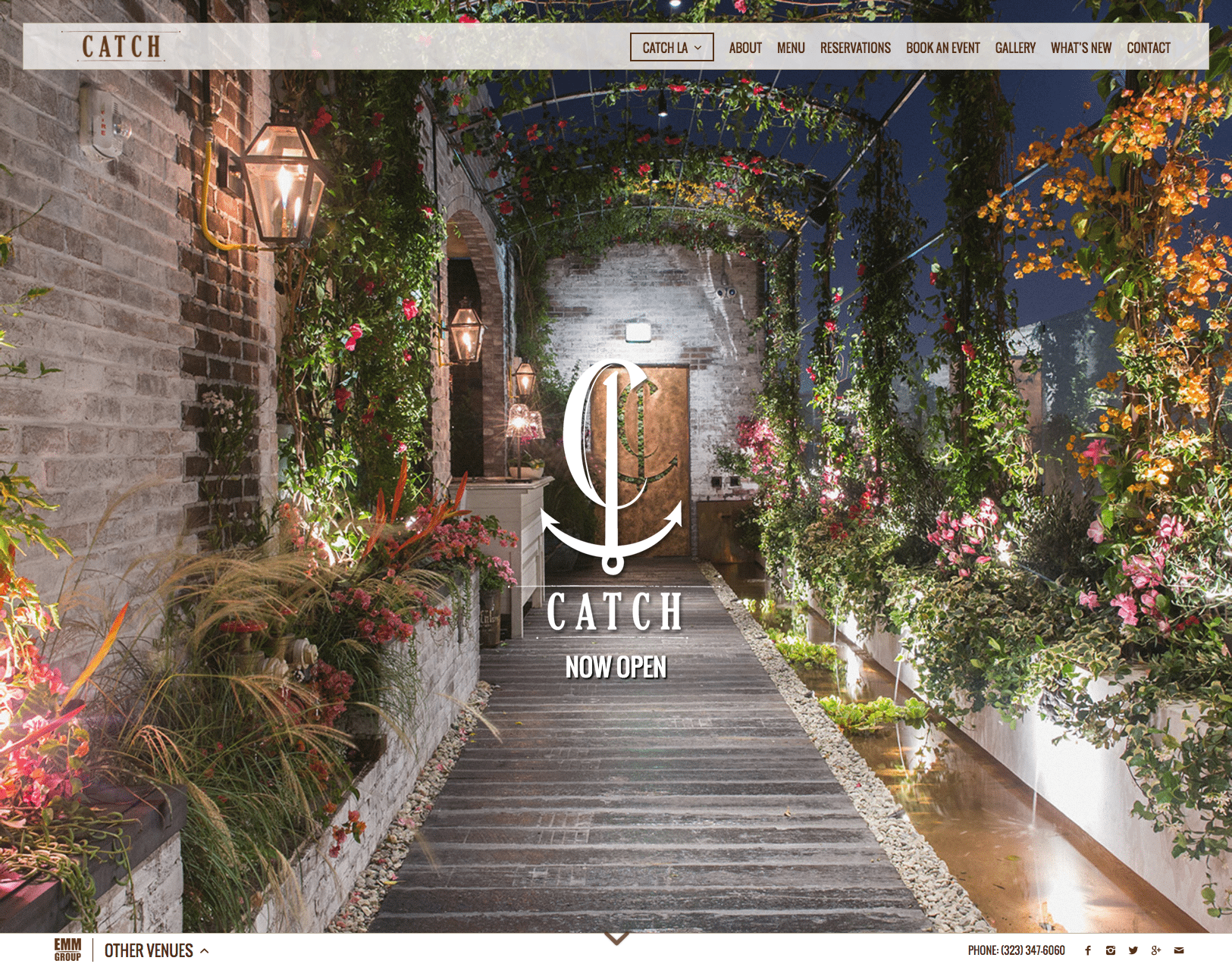
To start off, here is the website for Catch LA. I love this website because it starts off by bringing the customer into their restaurant by using an inviting image of the pathway to their door. The professionally taken photographs show bits and pieces of the restaurant itself, surroundings, food, and beverages. This gives the customer sense of what the restaurant is about. As you may know by now, I have a pet peeve for downloadable menus due to its negative effect on SEO (Search Engine Optimization) but I should say that this section of the website is designed and organized in such a way that it each menu is easily accessed to download. The website also gives customers all the information they need to contact and dine with them.
2. Republique – http://republiquela.com

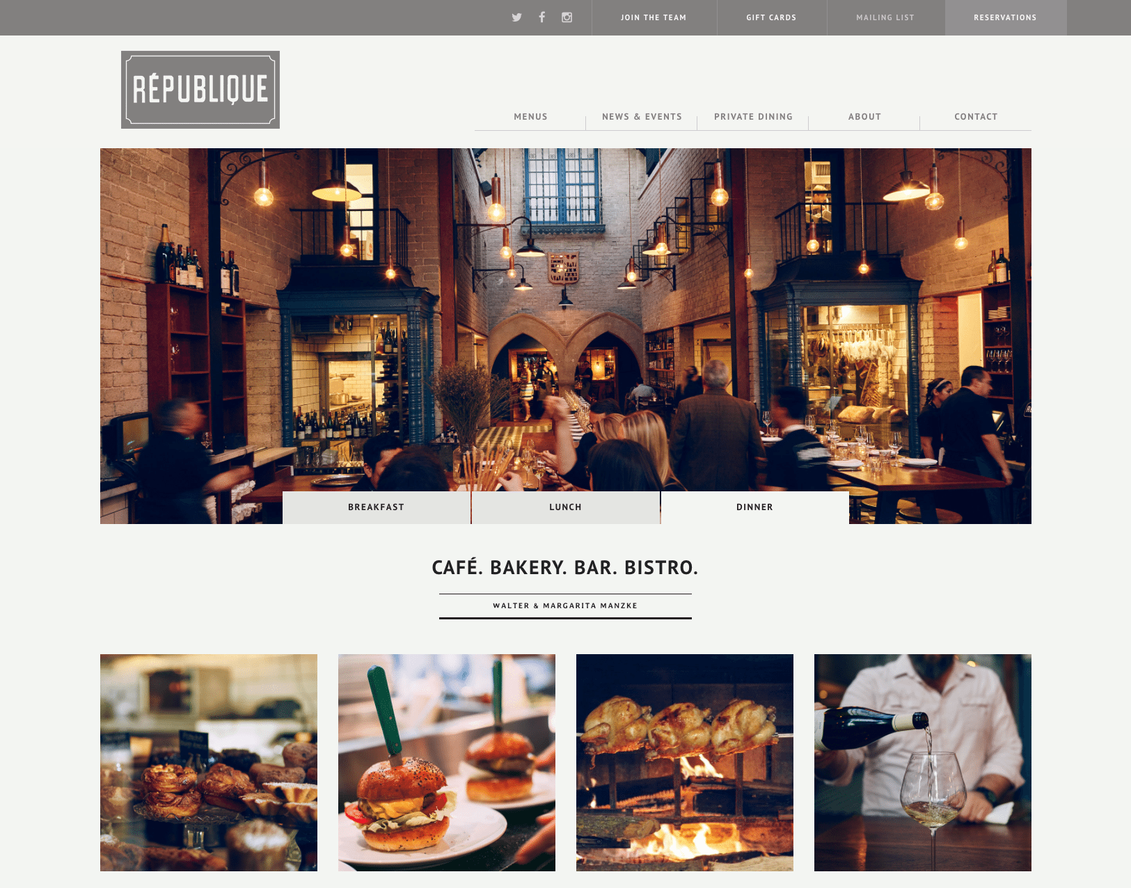
Ooh, this is another restaurant website I love. Its color combination of the brown, beige and blue for the buttons work perfectly well to put your mind and belly at ease when reviewing the website. Here, the photography instantly tells a story about the restaurant’s breakfast, lunch and dinner menus and then continues to bring you in by showing images that represent each menu type. In addition, these images link to their respective menus. Republique promotes their use of social media by adding icons that link to their respective pages and show off their Instagram photos to encourage the community to talk about their food. I also like how they show important links like their join the team, gift cards, mailing list, and reservations right at the top of every page. Overall the look of this website makes you want to visit it to experience the culture and food.
3. Lukshon – http://lukshon.com

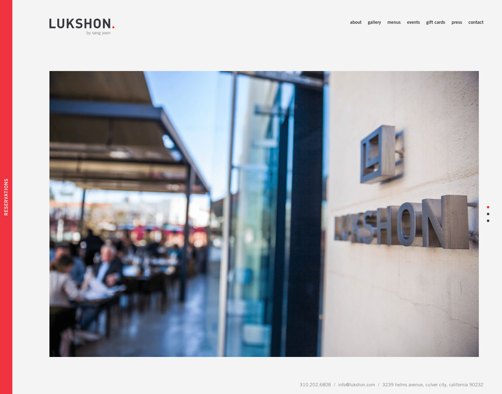
Now this one-page website for Lukshon is just simply modern and beautiful. It is a fullscreen website so it takes up the space of the entire screen when viewing it. What excites me, is their reservations tab. The red color draws your attention as intended and reiterates the fact that they are trying to encourage customers to book a table. The functionality is just plain “cool” as it slides from the left side of the screen and takes the full screen when opened. The image menu here is a deduction because it has a low resolution, is hard to read and bad for SEO (Search Engine Optimization) but their photos are very professional with a style matches the modern website feel. Lukshon also integrates their social media on the website as a good way for the community to get involved.
4. Here’s Looking at You – https://www.hereslookingatyoula.com

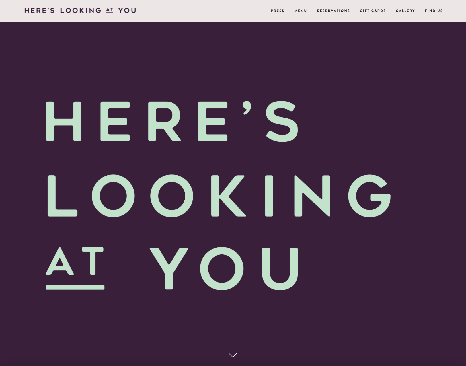
Here’s Looking at You has a website that simply does a great job of capturing their brand. The header image, it grabs attention right away with its bold text and vivid color contrast. You will notice that in the gallery, there is an image of their large shop window that looks just like header image. I thought that was cool. They did great by adding a link to a review article right in the middle of the home page. Adding reviews to a website builds trust, which is great for customers.
5. Bestia – http://bestiala.com

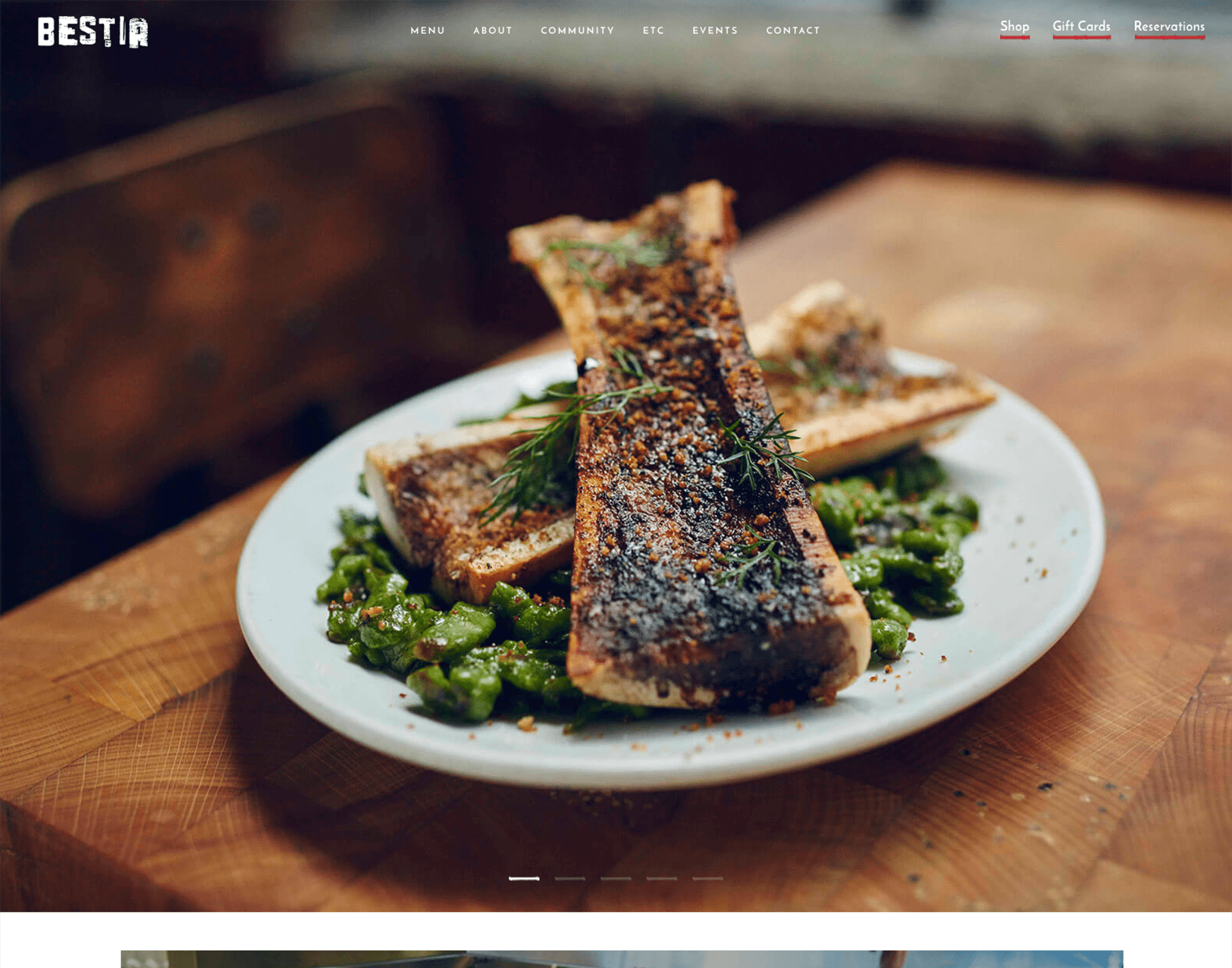
I simply adore this website for Bestia because it really gives you a sense of the culture of the restaurant. It shows the unity between the chefs and employees and gives you a great idea of the food they serve by their image choices, color choices and design style. I also love how their menu is legibly listed and broken up into sections by images describing the section.
6. Alma – http://alma-la.com
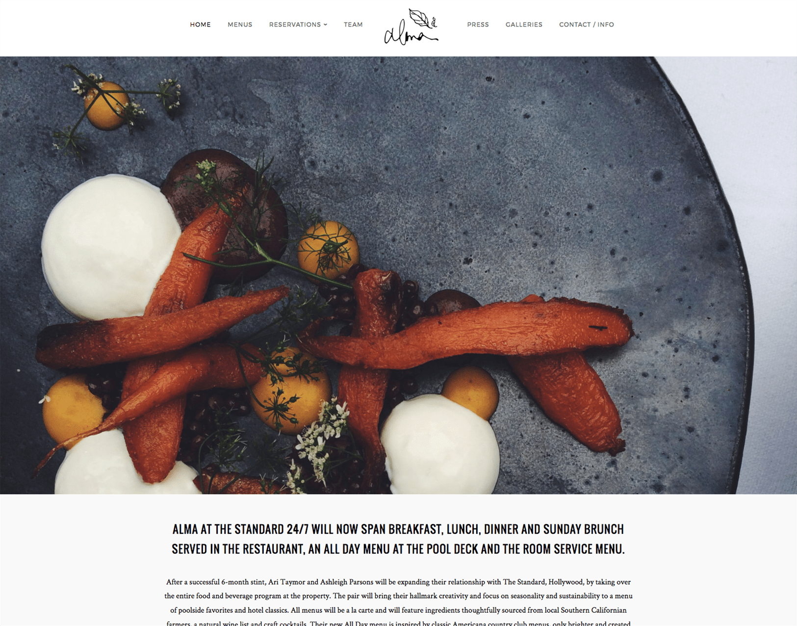
Minimal and modern are the words I would use to describe Alma’s website. The simplicity of the website and the raw and imperfect nature of the photos and food create a very rustic feel. I fell in love with this website because it has a lot of character. I was a is a nice touch including their pup as a member of the team because it shows emotion. Very inviting … I really want to go there.
7. Vallier Bistro – http://vallierbistro.com/en

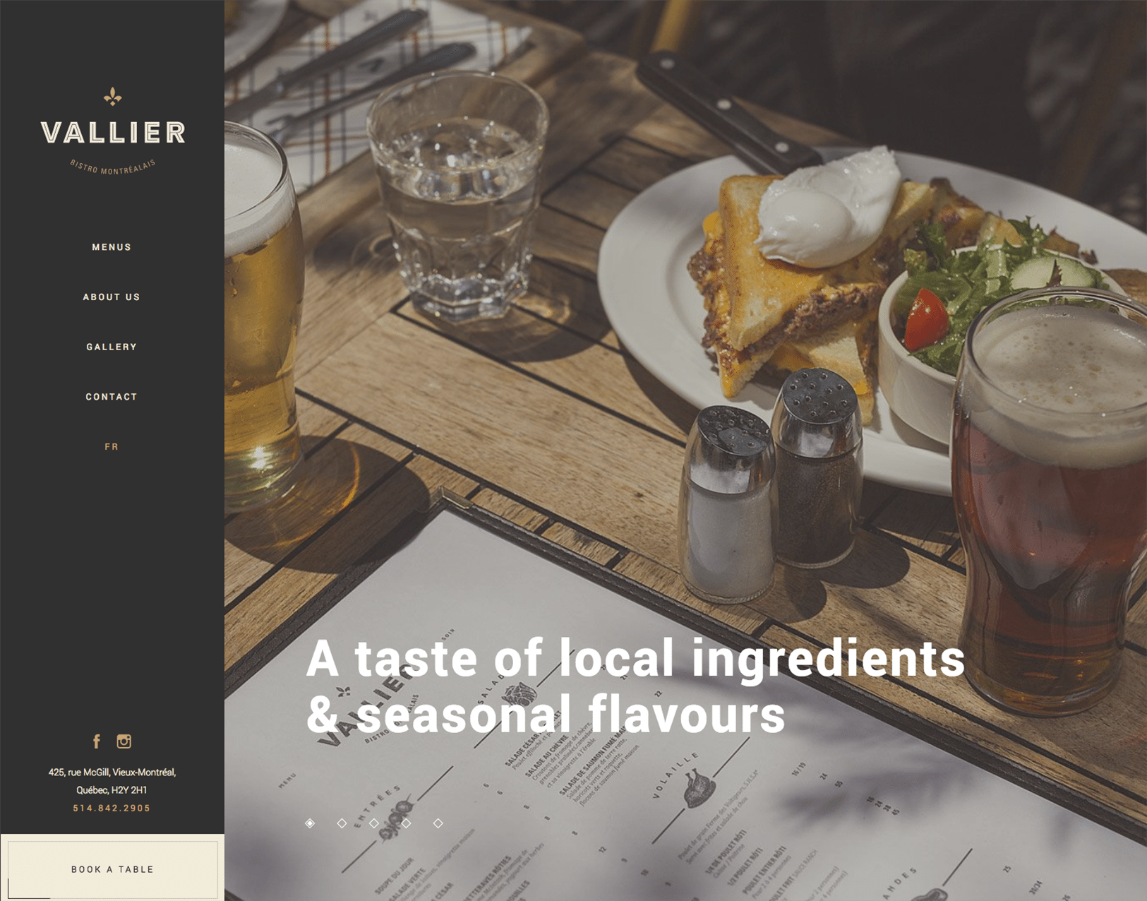
Vallier Bistro is a restaurant located in Canada and it simply exudes high-quality food and a classy atmosphere. Once you get to the website, you are invited with a full-screen zooming slideshow of images of the food and atmosphere of Vallier overlayed by titles giving details about who they are as a restaurant. The one-page website works well with the minimal content because it provides us with straightforward information about them, their food, and how to find them. Seriously, when you think about it, these details are the basics of what customers need to see on a website to make a quick decision on where they want to dine. Overall, straight to the point, beautiful, and classy.
8. Black Bottom Cafe – http://blackbottomcafe.com

Black Bottom Cafe is a restaurant that serves healthy southern food for pick up or delivery. Their colorful images give customers a visual taste of their cooking. I like that they promote southern hospitality with their image choices. The script font in combination with the bold text for their section titles definitely places a lot of emphasis on the sections. Their menu page is laid out very clearly and provides a good amount of detail about their food choices.
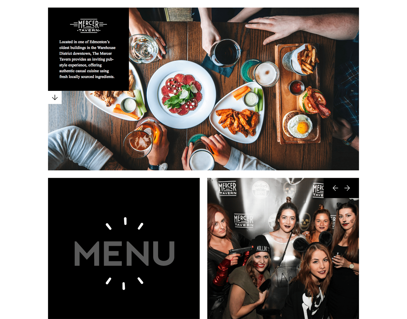
9. Mercer Tavern – http://mercertavern.com

Yeah, yeah, I know I have mentioned in almost each of these reviews how much I love each website but this one here is one that I really, really love. The Mercer Tavern website is just simple. It is a one-page site that uses a grid layout with all the information you need right in front of you. It has a main image, menu, photo gallery, hours, contact information, careers, social and newsletter sign up simply placed on the one-page site. Flashing text is a thing of the past but how they use it on the menu button is attracting and less intimidating.
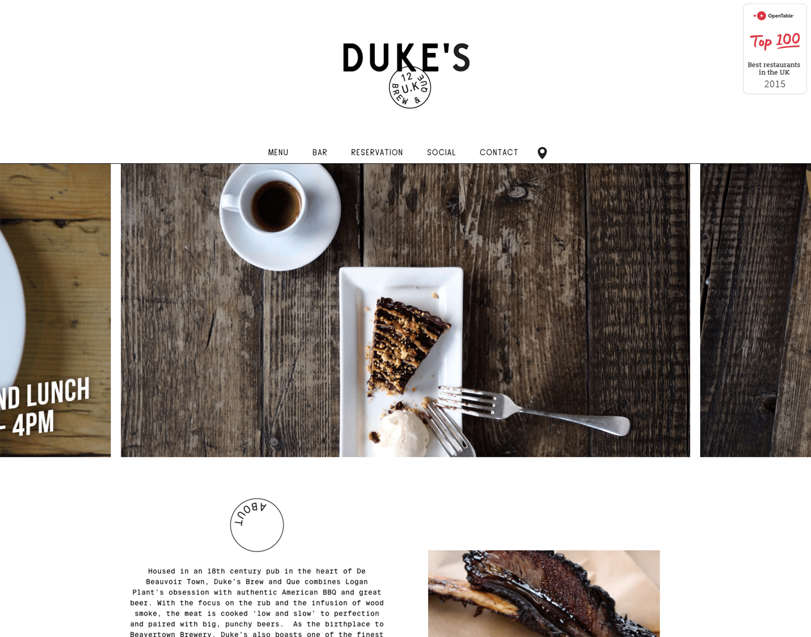
10. Dukes – http://dukesbrewandque.com

Duke’s is another example of a good one-page website. The monospaced font type gives a hipster feel to the design. I especially like how they integrated their social media into the navigation of the website so it is so easy to find them.
Well folks, that’s all I have for today. I hope these 10 successful restaurant websites were as great of an inspiration for you as it was for me. If after looking at these, you feel that it is time to get your website redesigned or newly designed, I highly recommend discussing this with your web designer or contact me here at ASBA for help. Good luck!

by restaurantspider | Aug 3, 2017 | Updates
Ever been afraid of doing something, but do it anyway due to the benefits? Well, this Monday (7/31/17), I had the pleasure of going to my first mixer held at the Karl Strauss Brewery in downtown Los Angeles. Yay!?
A few months ago, I made a commitment to my customers and myself as a restaurant website designer and signed up with the California Restaurant Association in hopes of getting more insight into the restaurant industry. As part of the perks, I get the opportunity to attend conferences, mixers, events etc. hosted by the association and other related restaurant organizations.
Well, this summer mixer was about networking but for me an opportunity to learn more about the struggles or pain points of the restaurant owner. I was freaked out because just the thought of going up to people I don’t know to introduce myself seemed very foreign to me, even though I meet new people almost every day. Well, to my surprise, the first person I introduced myself to was Fred Glick, the vice president of the Karl Strauss Brewery and his wife Alicia. I didn’t know who Fred was at first because even though he introduced himself, I could not hear a thing, due to the loud music and white noise from conversations between people. Luckily, I didn’t miss the fact that he was a restaurant owner so that got the conversation started. We went right into talking about restaurant websites because he was curious as to what I do for a living. We talked about the needs of a restaurant website and here are some of the points I gathered from him:
Great Images. Restaurants need to hire a professional photographer to take great images of the food served. Lighting is key to a great photo and this is where the photographer brings their expertise.
Email Marketing. Restaurants need to have the option for customers to be able to sign up for their mailing list to get connected with their community.
Social Media. Restaurants need to create social media pages and have social media icons on the website as a way for customers to connect with them.
Online Ordering. Restaurants need to offer online ordering and it’s up to the website designer to make it prominent enough for customers see it, and take advantage of it
This conversation with Fred was a great ice-breaker. It was also great to know that the pointers he gave me were features that I already include in my website packages. Knowing this gave me the confidence to go out there and face the crowd to share my knowledge and gain some more knowledge in the process. Here are a few of the other businesses I met that offer a great service to the restaurant industry:
Heartland: Payment Processing Systems
Goslyn Environmental Systems: Grease Removal
Restaurant Revolution Technologies: Online ordering and take-out systems
Casa Cordoba: Spanish Restaurant located in Montrose CA
Mo-Mo Paradise: Shabu Shabu Restaurant located in Rowland Heights and Torrence, CA
Overall, this was a great experience and I encourage everyone to get out of their comfort zone from time to time for a benefit of their business and personal development.
Tell me about your first experience with networking and your thoughts about the process in the comment box below.

by restaurantspider | Jul 26, 2017 | Restaurant Marketing Tips
Today, I would like to talk about menus. It is so common these days to land on a restaurant’s menu web page and see links to download their menu. One reason why this is so common is that it is so easy to do. Basically, highlight a piece the text and link it to a pdf or version of the menu. Unfortunately, easy execution is not always the right answer. Even though downloadable menus save the designer sometime during development and gives the opportunity for a restaurant to display a copy of their physical menu, it does not make it easy user experience.
What Exactly is a Web-Based Restaurant Menu?
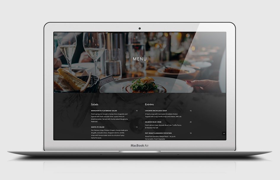
A web-based restaurant menu is basically a digital version of your physical menu that is typed out online and does not require the click to download feature to view the menu.
Below, I have put together a couple of great points on the advantages of a web-based menu.
1. Great for SEO
Since web-based menus are in plain text, search engines like Google, Bing and Yahoo can easily grab keywords from it which will improve your website’s search ranking.
2. Easy to View
Web-based restaurant menus are much easier to view because they are built to be legible on devices of all sizes. There is no need to pinch and zoom to view them as you would with a menu that is an image or pdf.
3. Easy to Update
Web-based restaurant menus are super easy to update. All it takes is the click of a button on your website editor. No need to wait for months to get your menu updated by a designer or printer to show your latest specials or newest additions.
4. Easy to Add Item Details
Unlike a printed menu where design spacing, alignment, and the page size is key to it’s success, the web-based menu is very forgiving due to an infinite amount of space for content. For example, if you need to add all the key ingredients of a meal to a menu for allergy purposes, you will not need to be concerned about how all that information is going fit.
5. Easy to Translate
This is a major plus for web-based restaurant menus if your restaurant is located in a very diverse area. Due to the wonderful world of the internet and WordPress, there are plugins that can translate your website just by having the customer select their preferred language. This is completely impossible with an image or pdf menu unless you are willing to create separate menus for each language.
6. Higher Rate of Customer Conversion
If a menu is web-based, there would not be software issues regarding compatibility. For example, if your customer does not have adobe reader installed on their desktop or their mobile device is not able to view PDFs, the customer will not be able to view the menu. If a customer is not able to see the food being served, you could lose them.
7. Quicker Load Times
Web-based restaurant menus have quicker load times because they are text-based, unlike a pdf or jpg which require a larger bandwidth to download.
I hope you found this helpful. Make sure to inquire about web-based menus with your web designer on your website project!
Need a starter website to get you in the online space and provide our customers with an insight into your business?
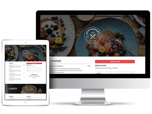
Check out our menu websites!

by restaurantspider | Jul 7, 2017 | Restaurant Tips
One of the reasons I decided to niche my design studio to the restaurant industry is because I am sick and tired of landing on bad restaurant websites. The internet is full of them! My dream is to make the restaurant website world a better place so it’s much easier for me and the rest of the world to easily select the right restaurant. As a restaurant, there are a few must-haves necessary for your website to be successful. Here are a few essential pointers I have compiled for restaurant owners and designers in the industry.
1. Mobile-Friendly
Your website should be mobile friendly especially because statistics show that 83% of people on the hunt for a place to eat use their mobile devices. If your website is not mobile-friendly, what happens? You miss out on a whole lot of potential customers! A responsive website is the solution to this issue. Responsive websites fit any device regardless of the screen size so no matter what device you’re on, it will display legibly. Having a website that is not mobile-friendly, also goes against the current Google standards and tremendously affects search results. Use the Mobile Friendly Test Tool to test if your website meets these standards.
2. Integrated Menu
For a restaurant, your menu is one of the most important parts of your business, therefore you want to make it super easy for your visitors to view it. Some folks might say, “ I will just upload a pdf of my menu, quick and easy”. Yes, it might be quick and easy but why would you want your visitors to have to download it to see the menu. Is that something you really want? Think about how slow that might be for visitors on devices. What if the menu does not download? Sadly, they leave :(. Having an integrated menu means that your menu will be displayed as text, not an image so your users do not have to pinch and zoom to try to make out text. Having an integrated menu makes it easy to see your menu and allows it to be easily found by search engines.
3. Gallery of Amazing Photos of Your Food
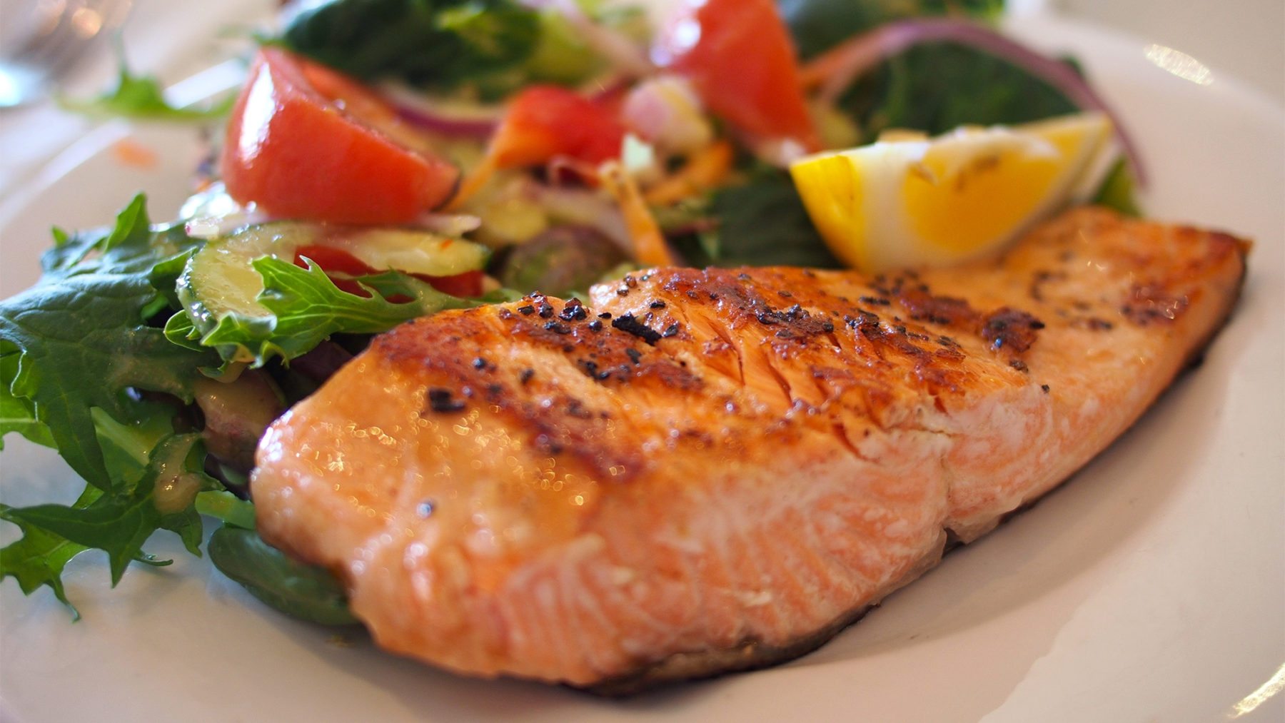
People love to see images because it helps them in their decision-making process. Showing just a few photos of your food will push you ahead of the rest and make your visitors crave your food. Photos give customers an idea about the type of restaurant they are ordering from which is something many people love to know. Just a few photos are enough as too many might overwhelm your customer. It is a great idea to invest in a professional photographer to take beautiful and professional pictures of your restaurant and food so here at ASBA, we offer a professional photography service to go along with your web design project. If interested, ask about our photography service in your consultation or if you are feeling adventurous and would like to try to take your photos yourself, see our post about tips on taking great food photos.
4. Social Media Integration
Think of social media (Facebook, Twitter, Yelp, Instagram etc) as your word-of-mouth promotion. People like to recommend where they dined to their friends and family. It’s just human nature. Get on this train to get the benefits. Just add your social media icons to your website but make sure you are active on these platforms and that they have content relevant to your restaurant. If you have a Yelp profile, look into adding a few testimonials from some of your happy customers to the website. Happy customers = more customers.
5. Online Tools for Reservation and Online Ordering
If you take reservations and phone orders, I highly recommend you have a tool for that on your website. Integrating tools like Yelp, ChowNow, Open Table, Door Dash, Eat24 and others will definitely take you a step further in standing out from the crowd and making it convenient/available for your visitors to eat from your restaurant.
That, my friends, concludes my tips for a successful restaurant website design. Are there any other tips you would like to share?


by restaurantspider | Jun 26, 2017 | Restaurant Marketing Tips
One of the things that get me super excited when I browse a restaurant website is beautiful, professional, mouth-watering photos. Beautiful photos give your restaurant a large step ahead of the rest in the restaurant-goer’s, online shopping world. Since photos are very important to us, we offer a highly professional photography session to achieve food and location photos to captivate your customers when they land on your website. For people feeling adventurous, I reached out to our photographer, Edrea Lara to come up with a few tips on taking great food photos for your website.
- Shoot outdoors in natural light or next to a window with lots of natural light. Most typical indoor lights have a yellow tint that will throw off the color of food pictures.
- Leave the flash off. Direct flash will cause harsh shadows and blown out highlights that will decrease the appeal of your food.
- Try different angles. Overhead, at 45-degree angle, eye level. Try going closer and farther away, so you have a variety of shots.
- Zoom in on textures and details. It adds a variety to your presentation and gives customers the feeling that you pay attention to the little things.
- Include a model or human aspect, like a hand holding a plate to show off your portions. Sometimes people want to know that the slice of pie they are going to get is bigger than their thumbnail.
- Add accessories! Like a napkin, silverware, or drinks in the background to enhance the look and feel of what your restaurant has to offer in addition to the food.
Let’s see your food photos. Comment below.
